Smart water
An app that connects to the new generation of smart water meters and provides users with real-time water use insights.
Background
Most residential water meters are analog but they are quickly being replaced by smart water meters. There is a big opportunity in providing people with more water use insights so that they can make water saving decisions based on real data.
Problem
4 billion people face severe fresh water scarcities and many are asked to conserve water. But where to start? ‘You can’t manage what you don’t measure’ applies here.
Solution
By providing residential water users with a smart water meter and an app that connects to it, consumers will get a lot more insight in their water use and associated costs to act upon.
My role
End-to-end UX & UI designer.
Timeline & tools
5 week (20 hrs per week) in 2021. Built with Figma, Miro and Whimsical.
Process
Based on the Design Thinking approach, these are the phases I went through in the process of designing this smart water meter app:
Empathize → Define → Ideate & Design → Test & Improve → 🙌
01. Empathize
Focus
I asked people about their experience with their water utility, their water use habits and what their attitude is towards a smart water meter app and it’s features. This information, together with research into the technical capabilities of smart water meters, lead the rest of my design decisions.
Desk research
I found out that the market for residential smart water meters is growing fast worldwide. Some US water utilities have already installed smart water meters and offer their customers an app that connects to it. Those apps can often be branded for the local water utility. I decided to design an app that the Portland Water Bureau would offer if they decide to replace the old analog residential water meters with smart ones.
I did a crash course into the technical capabilities of smart meters and associated apps through a feature comparison:
Interviews
I did four 1-on-1 interviews with people that are Portland Water Bureau customers that pay their own water bill. This way I would have the local Portlander’s perspective towards water use reflected and I could learn about their experience so far with the water utility.
The pains
The main pains that came up when I asked participants about their experience with the Portland Water Bureau are:
Current water use insights are non-existent but very much desired
The 3-month interval between bills is too long to make well informed changes in water use
Engagement with water utility is very low, people ‘set it and forget it’
This is a real example of the available water use insights that the Portland Water Bureau provides:
Everyone I talked to had tried to look up their water use online but all were disappointed that they couldn’t find more than this (they also didn’t understand it).
Aha!
I am a Portland Water Bureau customer myself so most of the pains described above didn’t come as a surprise. Most of the aha moments came when I asked about people’s attitude towards a smart water meter app and its functionalities:
Key takeaways
After creating an affinity map to further analyze the interview data, these would be the main things I kept in mind when designing the app:
Caters to both environmental and financial minded users
Provides detailed insights at the appliance level
Enables users to turn insights directly into action
Puts user in full control of how much and which data they see
Improves communication and engagement with the water utitlity
02. Define
User personas
I ended up with two personas because one of my interviewees had such a different take on things. Oliver helps me remind me that not every user is interested in analyzing detailed data to find ways to improve - they might look for context to see if they’re doing okay but then they put their phone away. If I had more time I would have interviewed more people to validate this difference.
Task & user flows
These are the two main flows I would be designing for, directly inspired by what the people I interviewed said they would love to use the app for. Based on these flows, I made a list of UI requirements per page that formed the basis for making the wireframes.
03. Design
Manage what you see
The first challenge was to find a way to let the user be in control of what they see on the water use dashboard of the app. I did some Crazy 8 sketching and from there asked people to pick their top 3. I created those in Figma to get feedback in a group critique session:
Option 1 came out as the winner!
Wireframes
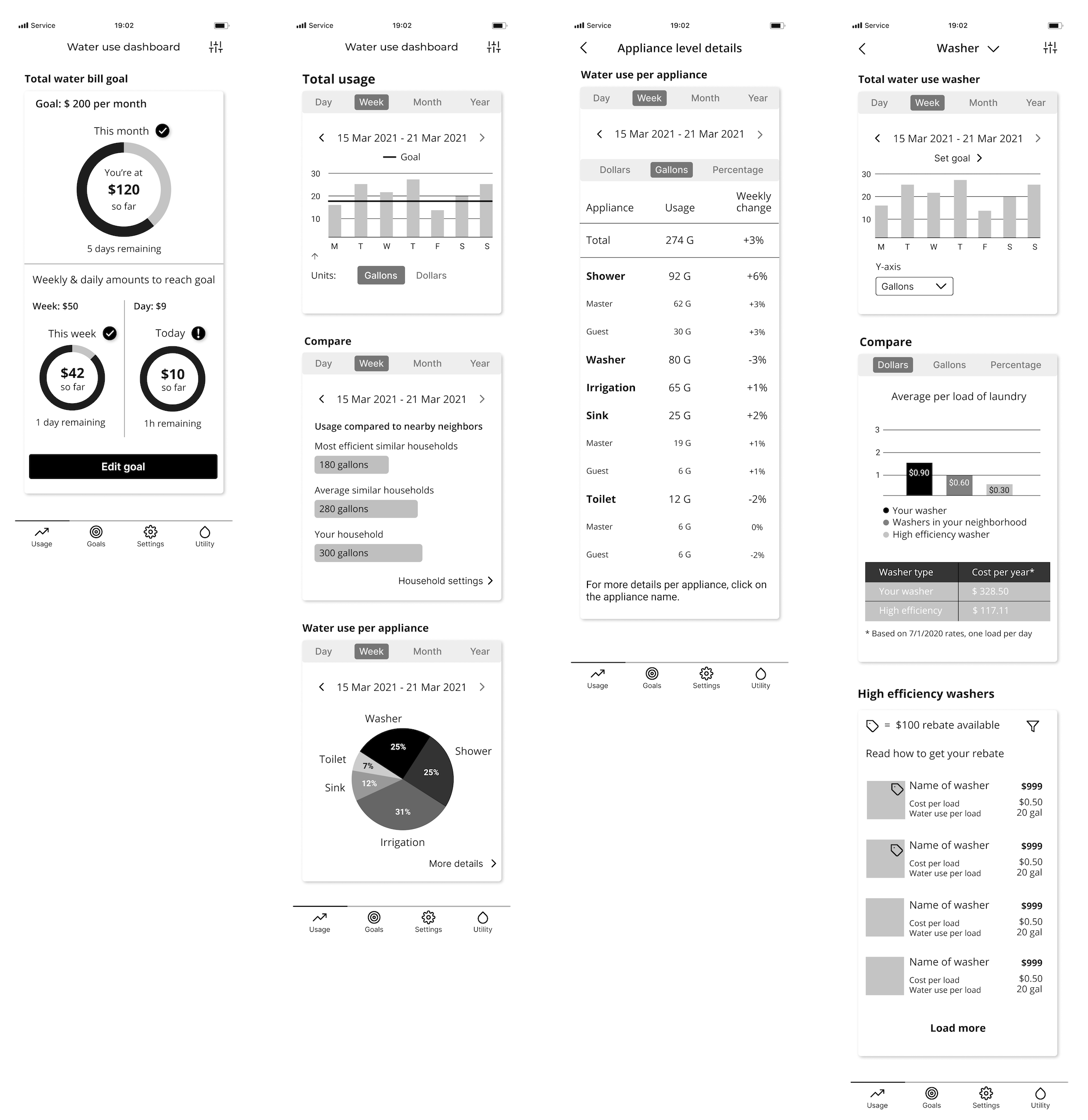
A lot of thinking and research happened before creating these wireframes. How much information to display? How to fit it all on such a small screen? I noticed that it quickly gets cluttered when displaying data, especially because I tried to give the user different options to see the data (in gallons and dollars for example).
Sketching it out


Logo & UI kit
Because this app will be offered to Portland Water Bureau customers, I used their existing logo. The color palette is inspired by the colors used in the logo.
UI design applied
This is a selection of high fidelity UI design frames that I used to build my prototype. It focuses on the two main flows: (1) looking up if it makes sense to replace your older washer and (2) set a monthly water bill goal to stay within a certain budget. The water use dashboard also shows your water use compared to nearby neighbors to get some context.
04. Test & Improve
Usability testing
To test my prototype I set up separate Zoom calls with three participants aged 26 - 35. I asked them to open the figma prototype on their phone and then ‘hug’ their laptop so I could see on Zoom how they used the prototype. I also asked them to talk out loud about what they were doing, seeing and expecting.
Results
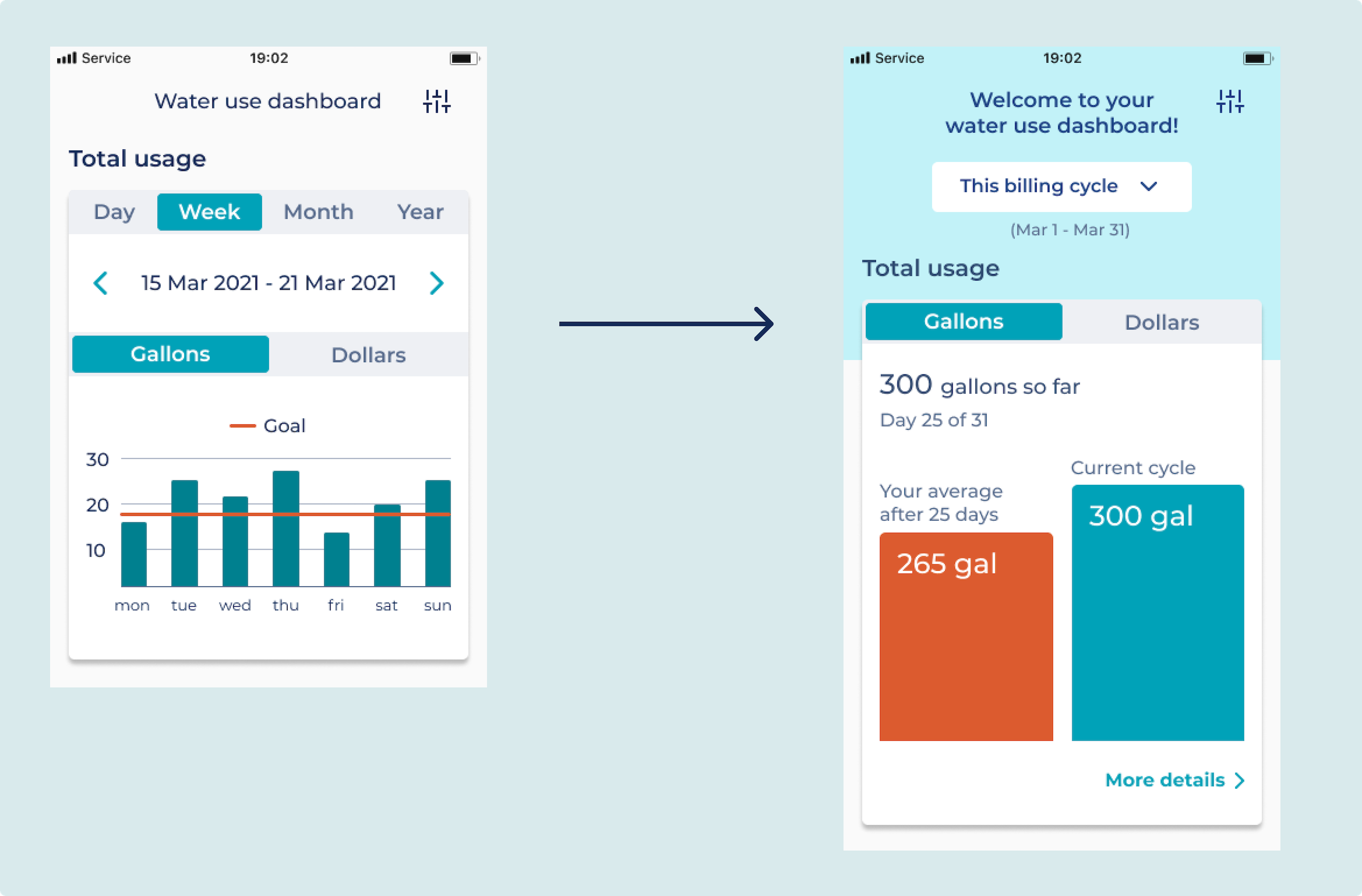
I got some great feedback and the overall message was: simplify! Most users skipped the water use insights that looked too complicated. I learned in a group critique session that it’s ideal to have a maximum of three data points per data visualization. I can always give the user the option to dive deeper into the data by adding a ‘see more details’ link.
In the feedback grid below you see more of the test results and everything in the ‘changes’ section is what I prioritized at this point and improved.
IBM feedback grid
Improvements
I made seven changes to the prototype based on the test findings. I’ll discuss the four biggest changes:
I simplified this card a lot so that the user at a glance gets an idea about their water use so far in this billing cycle. There is the option to click ‘more details’ and dive deeper into the data.
Simplify, simplify!
Users all skipped this graph because it’s too complicated to quickly process. Instead, a few key data points are shown with the option so ‘see more details’.
Less information, more color
Here I decided to not reveal all information at once but give the user the option to expand sections (the + and - symbols). I also made the weekly changes easier to interpret quickly with the use of color (green and red).
Small changes, big impact
A circle proved not the best visualization to show goal progress. Users felt like they wanted to fill the circle which is not the intention when setting a monthly bill goal, not filling the circle would be a good thing! I looked at the Mint app for inspiration where you can set a spending goal/limit and they use a progress bar similar to the one I used for this iteration.
Circle vs. bar
Prototype
This is the final prototype of the smart water meter app that includes the priority revisions I made.
Next steps
More testing! I’m very curious if my changes improved the user experience. The next thing that I would want to work on is a feature to help users reach their goals by giving them tailored advice for what they can do to save more water/money. I would also build out the area of the app for the utility so that the users can easily communicate with them through in-app messaging. One other thing that would be great to have is a way to update users about drought conditions and whether they are asked to conserve water and how much.
Reflection
Visualizing data on a small phone screen without overwhelming the user was my biggest challenge during this project. Unfortunately, some users were overwhelmed. This shows that even with the best intentions in mind you’ll need to go through many iterations to get to a good user experience. I personally can’t wait to get a smart water meter and find out where all my water goes!


